My favourite fonts to use with LaTeX (part I)
Table of Contents
Introduction
Fonts
Bembo
Palatino
Crimson
Libertine
Introduction
TeX and related systems are often associated with their default fonts, Donald Knuth’s Computer Modern (CM) typefaces. While these fonts are excellent, they have become so ubiquitous in the scientific community that many LaTeX users have sought alternative fonts for their documents. As a result, a plethora of font packages and even OpenType-compatible engines (XeLaTeX and LuaLaTeX) have emerged in the past 20 years.
A while ago, I set out to explore this extensive set of LaTeX font options. My goal was to select a small group of high-quality free fonts which I could later choose from when typesetting different documents. As I moved forward with my search, I also became interested in the history and rationale behind the design of different fonts and this led me to write some descriptive notes on each of my favourites.
In the paragraphs below, I list and give a brief description of seven fonts which I personally like (where the original fonts are commercial, I focus on free alternatives). These are: Bembo, Palatino, Crimson, Libertine, STIX, Charter and Utopia. I also provide a small sample of each font (containing both text and maths) so that the different choices can be easily assessed and compared. Longer samples for each font (code and resulting PDF file) are available on this GitHub repo.
When using LaTeX, three types of fonts can be selected and are commonly used: a roman or serif font which is normally employed for body text and which should have maths support; a sans-serif font which is sometimes used for headers; and a monospaced or typewriter font. When selecting a font for a document, it is therefore important to consider whether the font supports mathematical characters (at least if we will be typing some maths!) and also to choose an appropriate sans-serif font to accompany it (the monospaced font often differs more visibly from the roman).
This survey focuses on serif fonts as these are the usual choice for longer documents such as articles or books (although sans-serifs have become more popular for longer text in recent years). However, in keeping with the reasoning above, I have also selected accompanying sans-serif fonts for each of the seven roman choices below (all of which have maths support of some form or another). As a monospaced font, I chose Raph Levien’s excellent Inconsolata, a popular choice not only in the TeX world but also as the main font in text editors.
As mentioned above, engines such as LuaLaTeX make the use of OpenType fonts possible in LaTeX. While Type 1 fonts (which often have dedicated LaTeX packages) are the simplest to setup and are available on most distributions (which makes them a good choice when co-writing documents, for example), OpenType fonts are more complete and customisable in their options and represent the best current standard in digital typography. Whenever possible (i.e. when a font is provided in Type 1 through a LaTeX package and also available as OpenType) I provide two samples, one for each configuration. In the remaining cases, I use whichever format is available. I give further details on the configuration used for producing the samples as well as on the sources of the sample text in the final two sections of this text. And now on to the fonts!
Fonts
Bembo

fbb and Libertinus Math in LuaLaTeX
Bembo is the oldest typeface in this survey. Released by the Monotype Corporation in 1929, the font’s roman style is based on a design by Francesco Griffo (an Italian punchcutter who created the first italic type) from c. 1495. Aldus Manutius, one of the most important printers of his age, used the font to publish a short work by the cleric Pietro Bembo, after whom Monotype’s face is named.
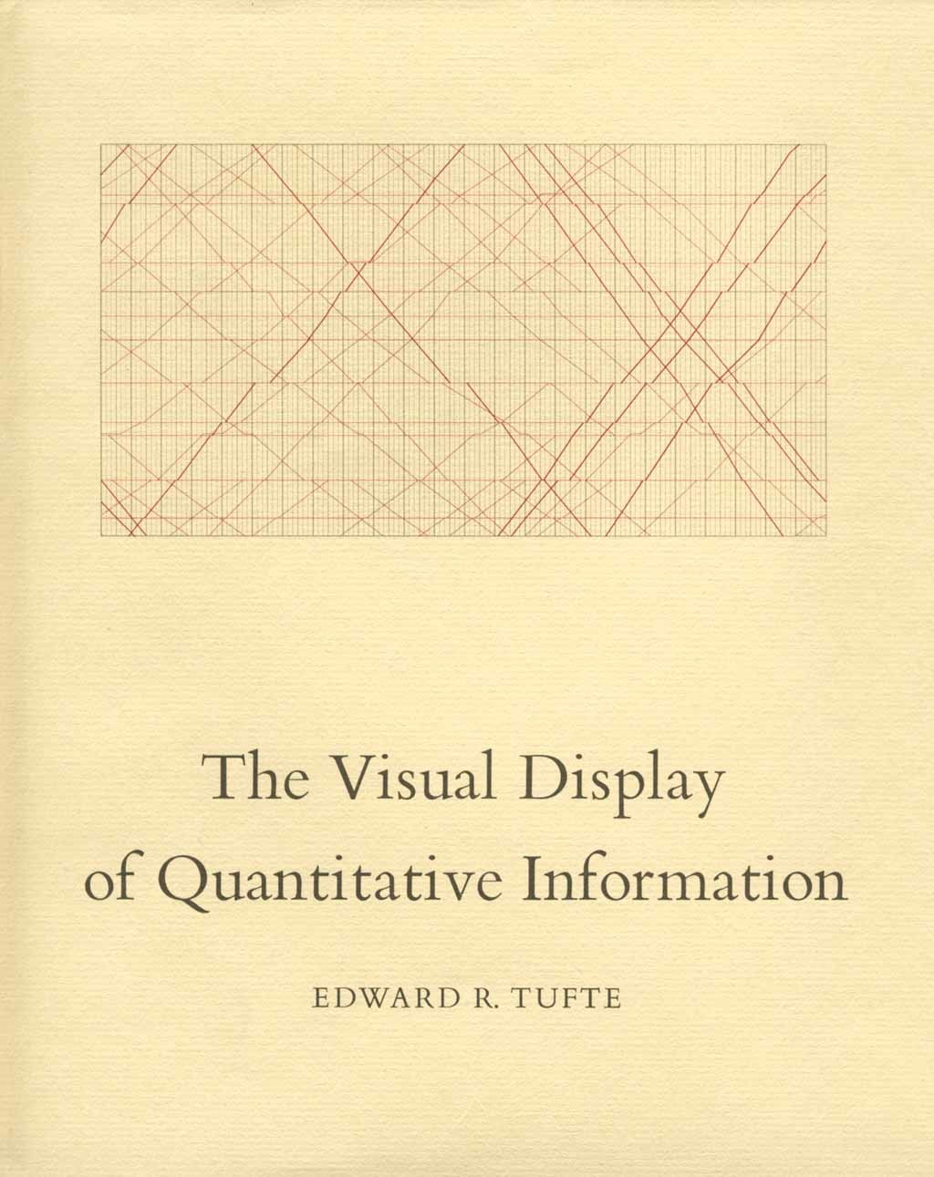
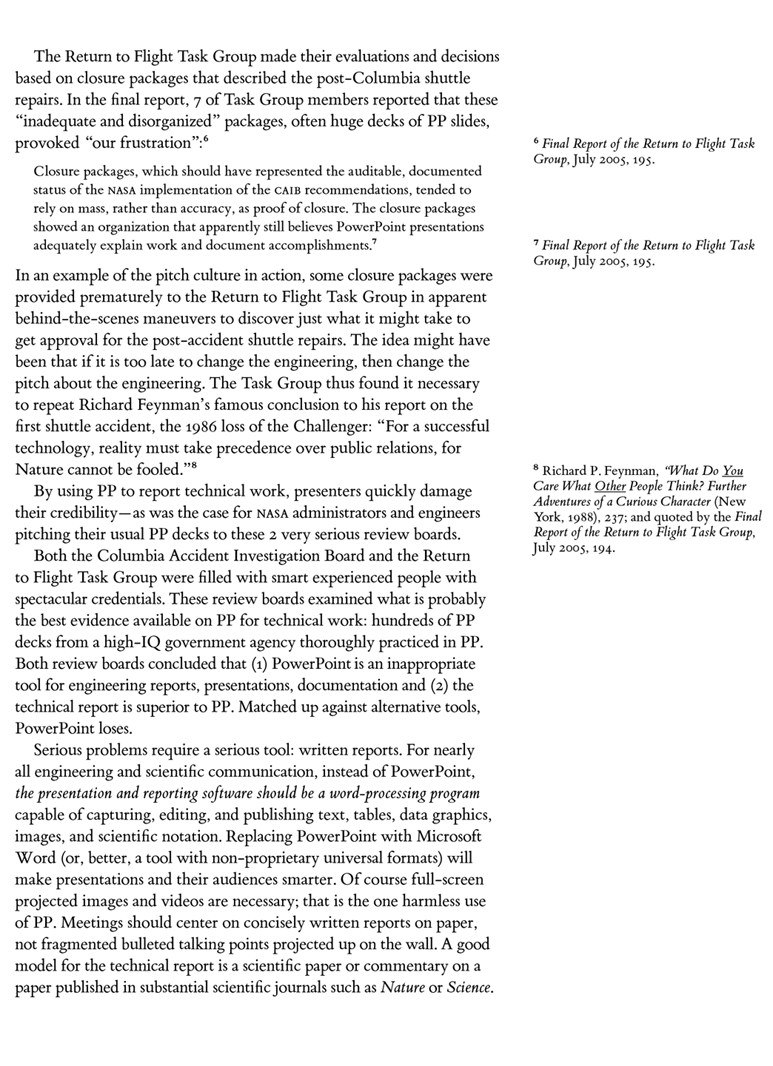
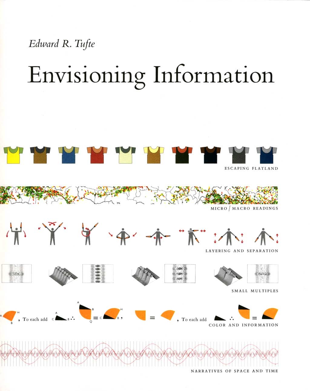
Bembo remains one of today’s most popular book fonts, having been used by publishing houses such as Penguin Books or the Oxford University Press. While its old-style appearance may make it unsuitable for certain documents, Bembo has received some attention from the LaTeX community. This is due at least in part to the work of Edward Tufte (known among other things for his writings on data visualisation) whose remarkably-well-designed books use Bembo as their body text font. While these books were not composed in a TeX system, they have inspired the development of the tufte-latex document class to produce similarly designed books as well as handouts.
Books by Edward Tufte (click to enlarge). Source: Edward Tufte, via Fonts In Use. License: all rights reserved
Monotype’s Bembo is a commercial font, although a web-font version of ET Book, the font used in Tufte’s books, has been made available for free by Tufte himself. A more complete free alternative is Cardo, developed by David J. Perry and also based on the typeface cut for Aldus Manutius. Designed with the needs of classics and linguistics scholars in mind, Cardo has been modified and extended by Michael Sharpe for use with LaTeX through the fbb package. The fbb font is available in both OpenType and Type 1 formats and is thus suitable for use with OTF-compatible systems such as LuaLaTeX as well as pdfLaTeX.
While no maths companion font is available for fbb, Sharpe suggests the Libertine-style maths font provided by newtxmath with the libertine option in pdfLaTeX. In LuaLaTeX, I instead use Libertinus Math, an OpenType maths font developed by Khaled Hosny which is covered below.
Regarding sans-serif companions for Bembo, Tufte’s books use Eric Gill’s highly popular Gill Sans. Like Bembo, Gill Sans is commercial and because of this I chose Gillius ADF, a free font inspired by Gill Sans and available in OpenType format, as an alternative. The gillius package provides support for pdfLaTeX as well as LuaLaTeX and XeLaTeX.
Palatino

TeX Gyre Pagella in LuaLaTeX
Palatino is one of the most widely-used and recognisable fonts of the 20th century. Designed by Hermann Zapf and first released in 1949 by the Stempel foundry, Palatino was inspired by old-style Italian Renaissance types and influenced by Zapf’s expertise in calligraphy. The font is named after Giambattista Palatino, one of the best-known calligraphers of the Renaissance period.
Palatino was originally intended for use in headings and display printing and aimed to be clearly readable even on small sizes and poor-quality paper. Two distinctive features which contribute to its legibility are a larger x-height and wider apertures when compared to other fonts in the Renaissance tradition.
In the TeX universe, Palatino-style fonts are perhaps the most commonly used serif fonts after the default CM Roman. The close relation between Palatino and TeX goes beyond its mere frequent use with the typesetting system, however. Indeed, Donald Knuth discussed the design of CM Roman with Zapf (see the photo below), who would later create the AMS Euler maths font with Knuth’s assistance under commission by the American Mathematical Society (AMS). Zapf was also an honorary member of the board of the TeX Users Group since 1980 with the title of “Wizard of Fonts.”

Donald Knuth (left) and Hermann Zapf (right) (click to enlarge). Source: Bettmann, via Getty Images
Like Bembo, Palatino is a commercial font. Fortunately, several clones of the original font have been developed over the years and are available for easy integration with LaTeX. In pdfLaTeX, I chose the text font provided by the newpx package. As maths fonts, I provide samples using the maths companion font provided by the same package as well as an Euler-like font provided by the eulervm package. As you can see in the sample below, Euler has a distinctive look as a maths font with its upright letters instead of the usual italics. In this respect it aims to reflect the typical handwriting of mathematicians on the blackboard.

New PX and Euler-VM in pdfLaTeX
Unlike many free fonts which are only available in Type 1 format, Palatino also has a free OpenType clone with maths support: the GUST project has developed the TeX Gyre Pagella font for which an OTF maths companion font is conveniently provided (there also exists another free OTF maths font in Palatino-style called Asana Math). Unfortunately, there is no complete OpenType version of the Euler maths font: only an abandoned port named Neo Euler (developed by Khaled Hosny) exists. Because of this, I do not provide a sample with an Euler-like font in LuaLaTeX.
The most natural sans-serif companion to Palatino is probably Zapf’s recent Palatino Sans font. Optima, perhaps his best-known creation after Palatino, could also pair well with it. Unfortunately, both of these fonts are commercial and no free clone is available for easy use with LaTeX (the free URW Classico, an Optima clone, is available as a LaTeX package but is not included in most distributions).
An alternative approach to looking for a sans-serif font which closely matches the serif in its design is to choose a visibly different sans font. Unlike a loosely matched sans font whose differences relative to the roman can create an unwelcome mild dissonance, a clearly dissimilar font can relieve this tension by making the high contrast a feature of the design. In this spirit, several LaTeX packages which use a Palatino clone as their main text font have opted for a Helvetica clone as a sans-serif companion. Here I follow this approach by choosing TeX Gyre Heros, a free Helvetica clone also developed by the GUST project. Heros is available in both OpenType and Type 1 formats, and a package is provided for easy use of the latter with pdfLaTeX.
Finally, an interesting set of fonts based on Palatino (derived from URW Palladio) but with a unique and distinctive character is Kp-Fonts (the Johannes Kepler project – no relation to Robert Slimbach’s Kepler font) developed by Christophe Caignaert. This complete set of fonts (it contains roman, sans-serif, monospaced and maths fonts) is available for use with LaTeX through the kpfonts package. Each of the three text fonts includes old-style figures and true small caps and is available in both the standard weight as well as a lighter weight. Even the default version of the roman font is, however, of a lighter weight than Palatino and in this respect is more similar to Aldus, a second font designed by Zapf which is similar to Palatino but intended for book use. For an example of the Aldus font in use in a TeX system, see the documentation of the fontspec package which employs it as its main body font.

Kp-Fonts in pdfLaTeX
Crimson

Cochineal in pdfLaTeX
Crimson is a free, open-source font designed by Sebastian Kosch in 2010. At the time, Kosch says, high-quality free text fonts were scarce and so Crimson was developed with the laudable goal of providing a “workhorse font for the masses.” Crimson is an old-style font in the Renaissance tradition and Kosch mentions as inspiration some of the most popular 20th century revivals of fonts from that period such as Robert Slimbach’s Minion or Jan Tschichold’s Sabon.
Michael Sharpe’s cochineal package provides a fork of the Crimson font with many glyphs added to ensure appropriate support for LaTeX use. A maths companion font is provided through the newtxmath package with the cochineal option. Unfortunately, newtxmath is not designed for combined use with OpenType text fonts through LuaLaTeX or XeLaTeX. Therefore, and even though cochineal includes an OpenType version, only a pdfLaTeX sample is provided (which uses the newtxmath companion font). As a sans-serif companion, Sharpe uses Pablo Impallari’s Cabin (another font inspired by Gill Sans) in the documentation of cochineal and I follow this choice.
One of Crimson’s characteristics is its (coincidental, according to Kosch) similarity to Slimbach’s Minion font (although Crimson has a smaller x-height and more elaborate details – see the image below). Minion has become a standard choice for book typesetting since its first release in 1990 (for example, it is the main body-text font used in Robert Bringhurst’s classic text, The Elements of Typographic Style). Even though it is a commercial font, Minion (in particular its OpenType version, MinionPro) has gained popularity with LaTeX users as it comes bundled with some Adobe products and is thus available by default on some systems (the legality of using the font which comes bundled with Adobe Reader is dubious, however). While Crimson is not a clone of Minion, the similarity between the two fonts may make it a suitable free alternative for those looking for the now-classic look that Minion Pro provides.


Minion Pro Regular (top) and Crimson Text (bottom). Source: Adobe Fonts and Google Fonts
Libertine

Libertinus in LuaLaTeX
The Linux Libertine font family is perhaps the best-known example of an open-source font designed in the Internet era, and for good reason as it is an excellent font collection. While the three fonts we covered above are primarily inspired by old-style Renaissance type from the 15th and 16th centuries, Libertine draws more on the 17th century Baroque style as well as the modern book fonts of the 19th and 20th centuries, and therefore has a more contemporary appearance than either Bembo or Crimson.
Libertine was developed as part of the Libertine Open Fonts Project which was started by Philipp H. Poll with the goal of releasing fonts under a GNU license. An important reference in its design was Times New Roman and its predecessor, Times Roman. Despite the similarities between the two fonts, there are also some clear differences. In terms of dimension, Libertine has a smaller x-height than Times (which was optimised for readability at small sizes, having been originally designed for newspaper columns) and a smaller footprint overall (see the image below). Another important difference is in the serifs, with Libertine’s being flatter and less sharp compared with Times’ crisp, angular and somewhat triangular ones (see this interview with Poll for a more complete discussion of the rationale behind the design of Libertine and its differences relative to Times). The Libertine family includes not only the Libertine roman but also an accompanying sans-serif font, Linux Biolinum.

Times New Roman (top) and Linux Libertine (bottom) (click to enlarge). Source: osp blog
The Libertine fonts are widely used in open-source software, for example being included in Libre Office and having been used to set the Wikipedia logo. In LaTeX, the fonts have been conveniently packaged in the libertine package, with newtxmath providing an accompanying maths font through the libertine option (this font was also used as a maths companion for fbb above).
For the samples for this survey, I use not the original Linux Libertine fonts but the Libertinus family. This is a fork of the Libertine fonts by Khaled Hosny which provides an OpenType maths companion font (thus making Libertinus one of a very small number of fonts with OTF maths support) and fixes some of the bugs in Libertine. In addition to the roman, sans-serif and maths versions, Libertinus also provides monospaced and display fonts, as well as a semibold weight for the serif font; this level of completeness is one of its main strengths.
The libertinus package enables the easy use of Libertinus in Type 1 format (for pdfLaTeX) as well as OpenType. We provide a sample using both pdfLaTeX and LuaLaTeX. Libertinus Math is only available as an OpenType font and therefore for the pdfLaTeX example we use newtxmath.


